BACKGROUND
In Home CPR instructs on-demand, on-site safety classes throughout the San Francisco Bay Area.
ROLE
Lead UX/UI Designer
I was involved in the entire design process, from research and informational architecture to designing the final solution - high fidelity prototypes for both, desktop and mobil formats.
TOOLS
Sketch
Adobe Illustrator
Adobe Photoshop
Zeplin
OBJECTIVE
To design the website and make displayed information and CTA accessible and learnable by a broad spectrum of users.
BUSINESS GOAL
- To inform/ educate the user
- To get the user to convert ( schedule a class/ contact teacher)
- To sell AED
OUR USER
- Corporate office workers
- Medical Workers
- Nannies / Teachers
- Professionals in construction or similar industries.
- New Parents
- Others ( whoever desires to learn CPR and first aid techniques)
CHALLENGE
The InHomeCPR website is the major channel for users to gain information about the different types of first aid certificate and non-certificate programs, see the area of service, register for class by contacting company’s representative, and pay for class.. However, the current website has severe usability problems that makes it challenging for visitors to achieve their tasks quickly and accurately. As a result, the conversion rate has dropped drastically since the new (prior to my involvement) redesigned website was launched.
Some major usability issues were:
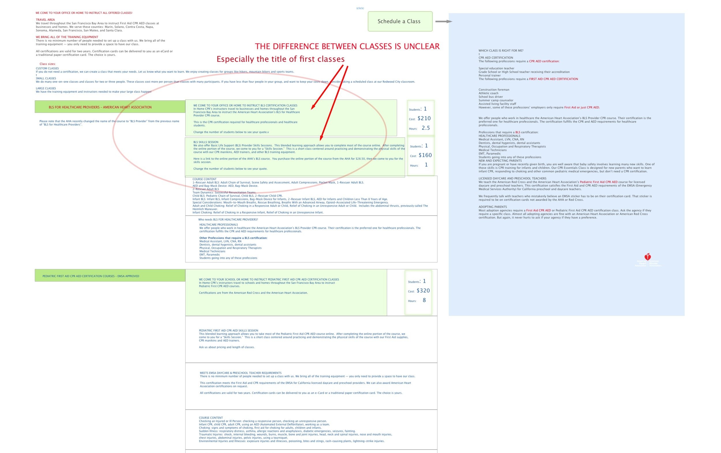
Disorganized and overwhelming content
Confusing IA and navigation
Lack of hierarchy and inconsistent CTA
LEGACY EXPERIENCE
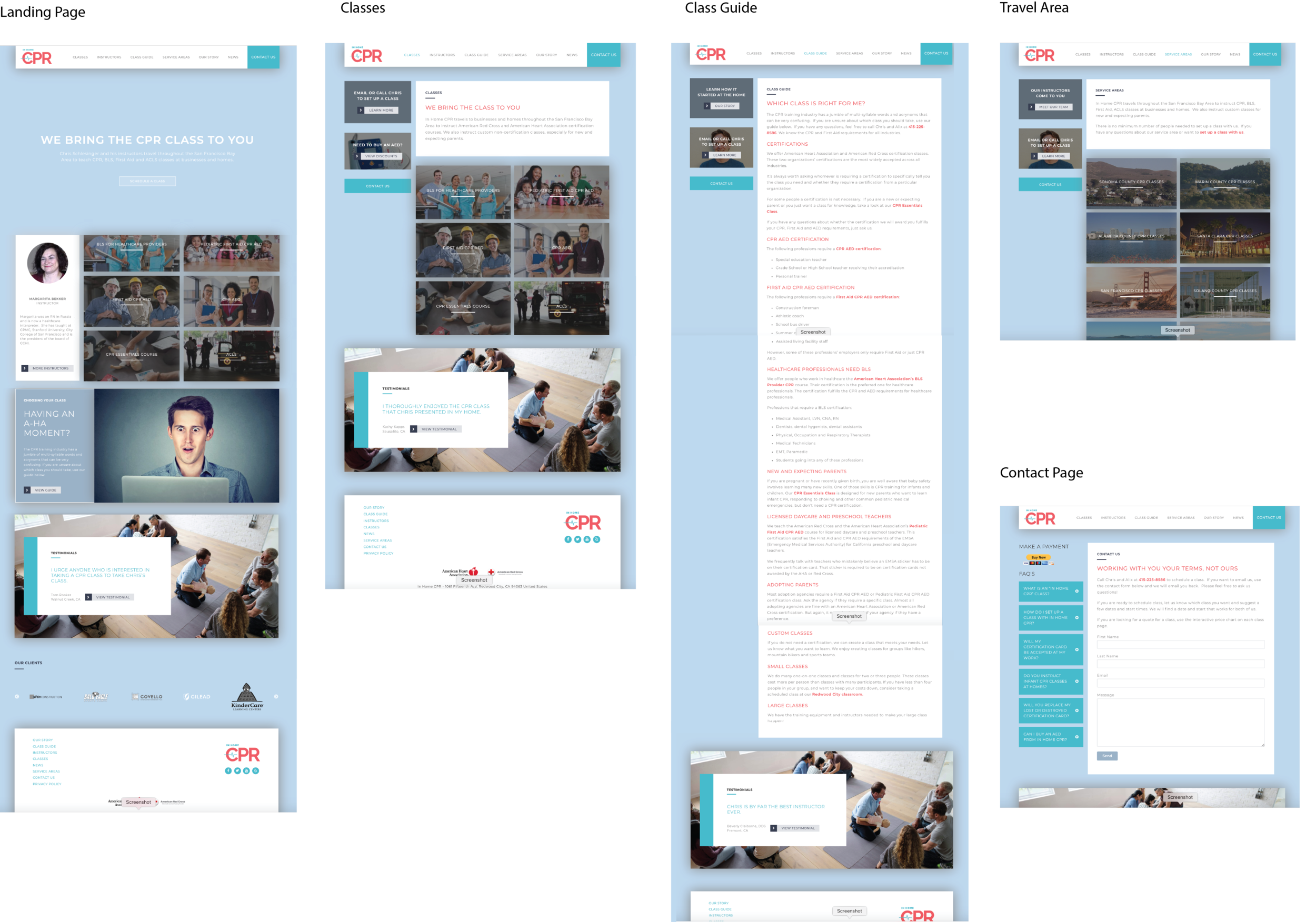
SCREENS FROM THE EXISTING VERSION OF THE SITE
USER PERSONAS
Based on the user research done through Google Analytics as well as some guerrilla testing over a cup of coffee, I came up with these user personas.
They combine the most common traits and problem scope of the typical InHomeCPR users.
INITIAL FINDINGS AND HYPOTHESIS
Too much unused space.
The text and call-to-action (schedule) buttons are hard to find.
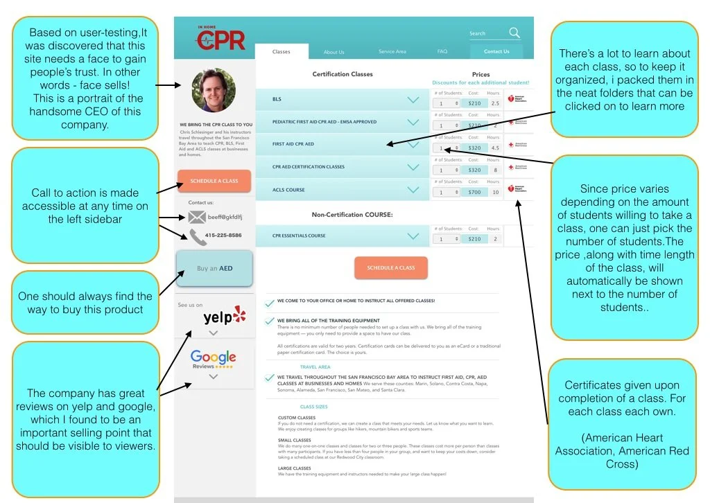
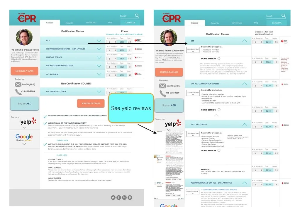
The classes and their prices should be displayed together and upfront, then ability to learn more about them upon request (click)
FAQ would be more useful ( and always accessible) as a part of the header navigation menu instead of being placed along the contact input window.
The reason for the left top part (buy now) is unclear.
Too many moving / animated elements = too distractive.
One of the moving elements- list of instructors should be replaced with a steady headshot of Chris’s (head of the company) photo. He’s got a nice smile that gives a human face to the businesses website.
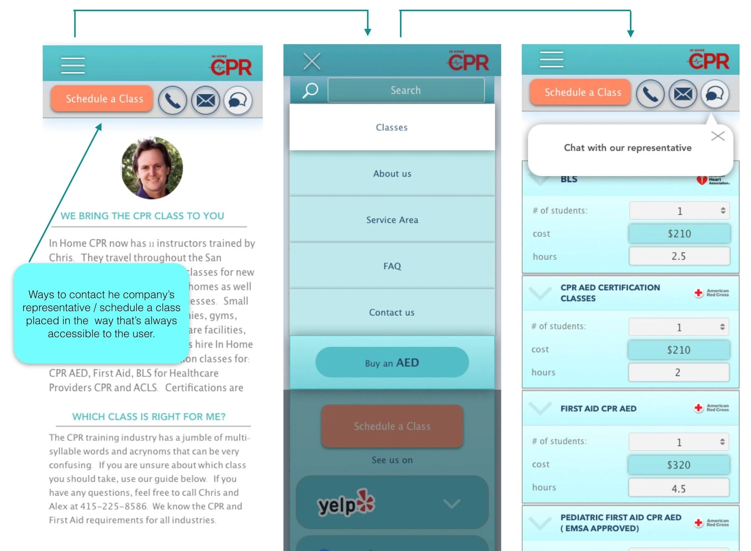
More CTA methods, no matter where in the page you’re in
“Need to buy an AED? ( discount prices)— No prices nor discount prices are available to a viewer, and no ability to actually buy it.
“A-ha moment” is an unnecessary element on the page. It takes up the page real-estate and does not provide new information, only some of the same info as the “class guide”.
It’s easy to forget where you are on the page since the navigation tab doesn’t identify it . Once one selects a navigation tab in the header it should be in active mode for as long as one stays on the same page.
Instructors: Looks ok except for the left section of the page where Chris’s face is covered up
Since “contact us” serves the same exact purpose as “our instructors come to you”, and “email or Call Chris to set up a class”, I’d leave just “contact us” and “schedule a class”.
“Class Guide” is, essentially, the extension of “Classes”, just more description about them. The reason to “why?” they are presented as different pages in separate navigation tabs is unclear.
A bay area map with depiction of the area of service would be a nice visual representation of the area covered by InHomeCPR services.
Testimonials - could use different formatting and placement... The placement of animated testimonials is a bit distractive and awkward. There are some nice and insightful things people are saying about their experiences with InHomeCPR. I’d create a separate navigation tab for it and place one quote (at the time) at the beginning of the landing page.
CONTENT MANAGEMENT
I gathered all the text from the existing website, to help me with the process of analyzing and grouping the information in the way that makes most sense.
IDEATION
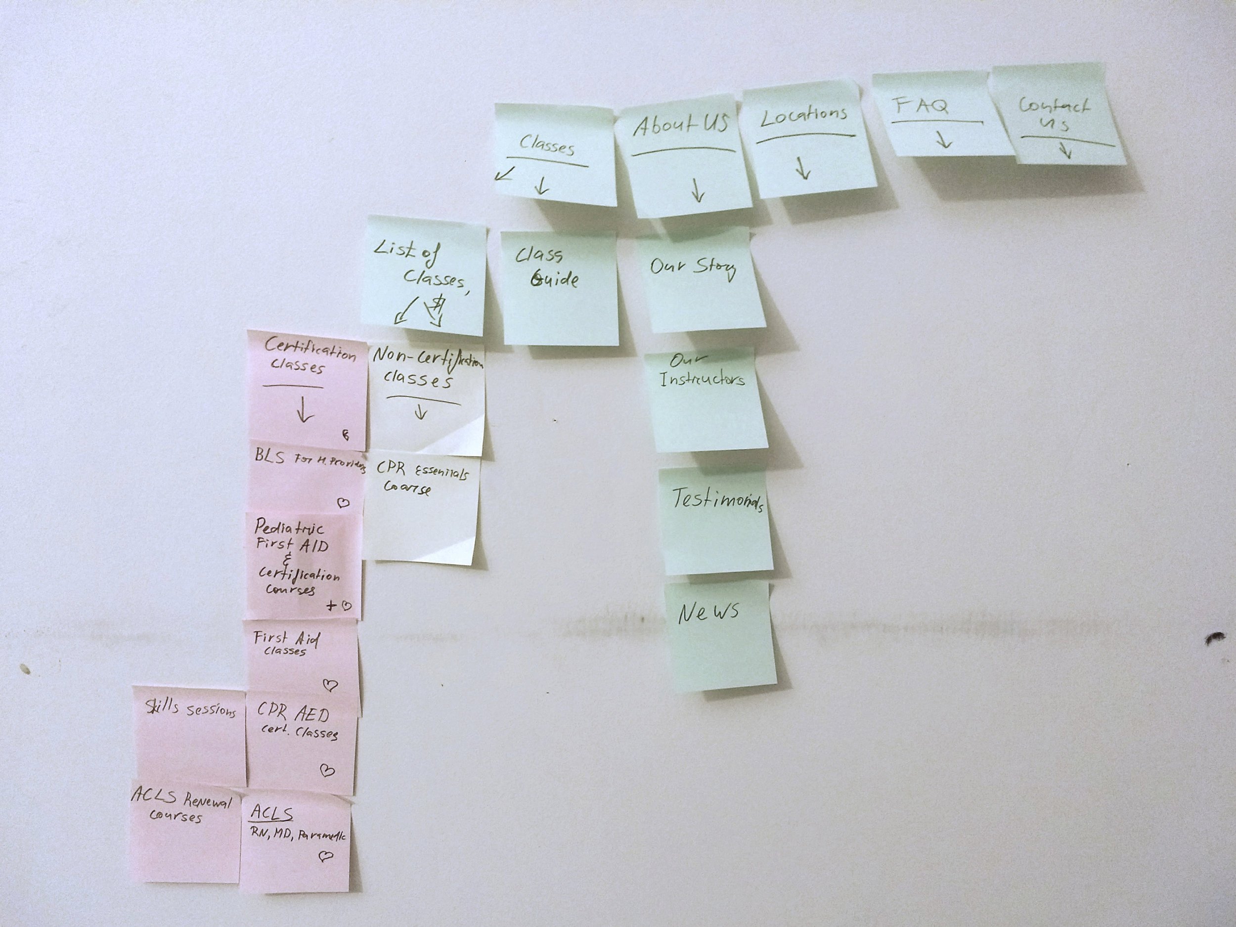
After an extensive research and making sense of the existing informational chaos, I identified common themes, grouped them into key categories, and organized those groups in an order of importance and appearance that’s familiar to people.
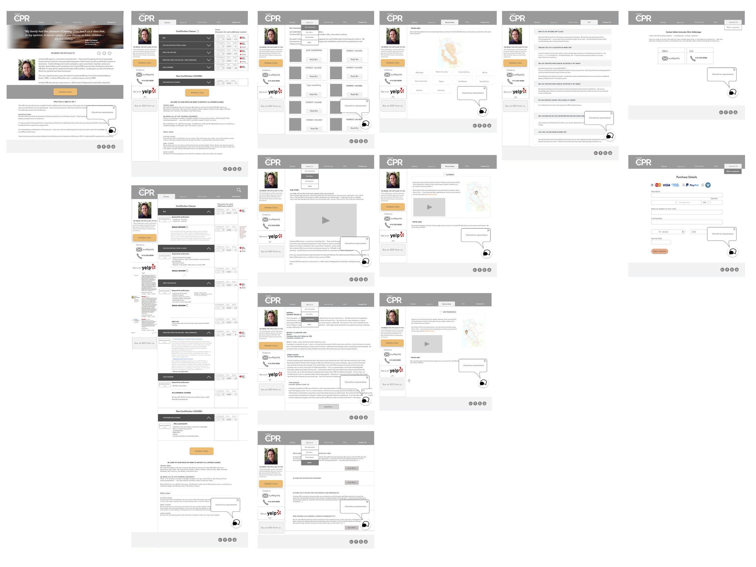
WIREFRAMING
HIGH FIDELITY PROTOTYPE FOR DESKTOP
SOLUTION DETAILS
PAGE “CLASSES”
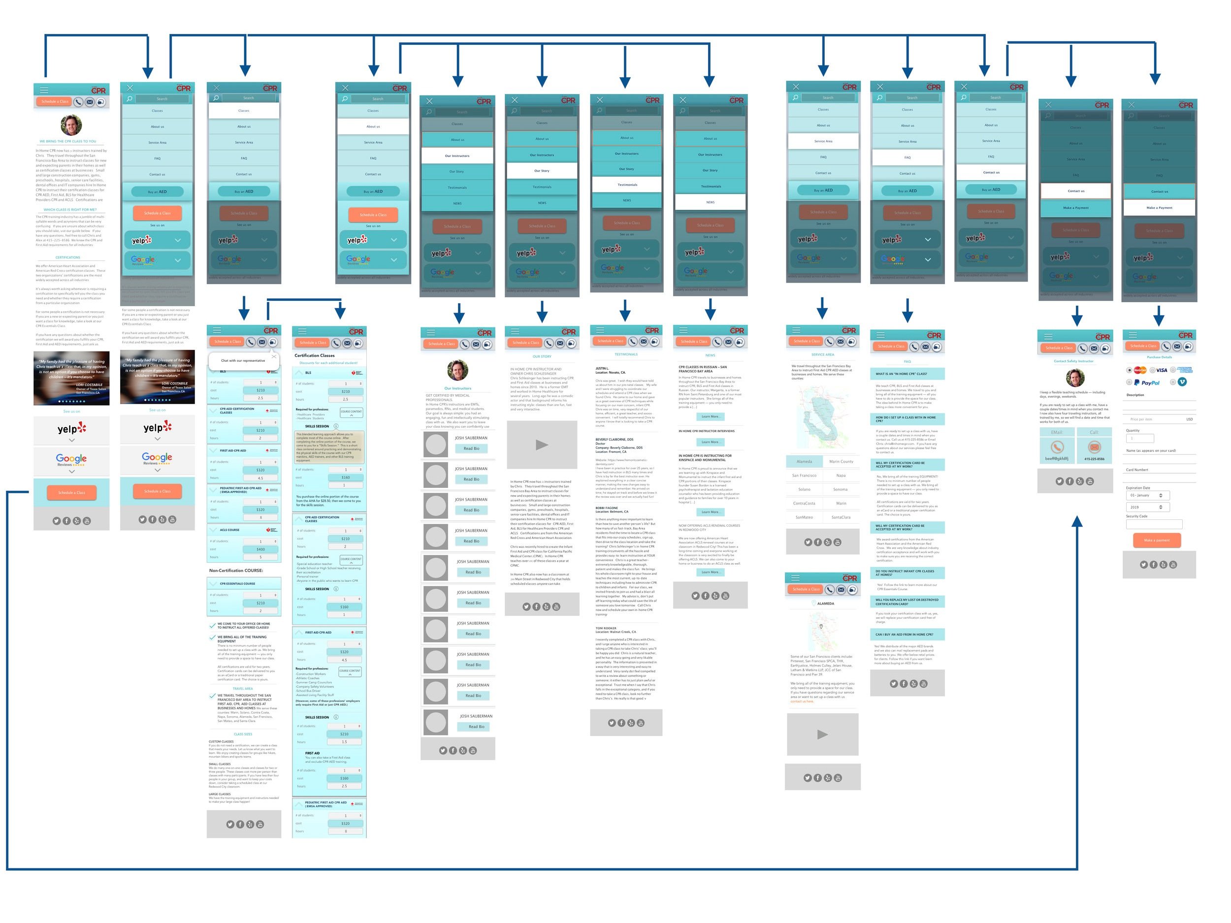
MOBILE PROTOTYPING
Since majority of InHomeCPR clientele use their phones to look up and schedule classes, creating a mobile version of the prototype was a must.
LANDING PAGE - HAMBURGER MENU - CLASSES
NEXT STEPS
This project is currently at the last stages of development and soon will go live!
After the site is launched, I would like to do some A/B testing to see the usability improvements as well as flaws and make corrections based on those findings.


