NETRA.io
BACKGROUND
Netra.io is a data analytics tool with image recognition technology to help extract a ton of insights around audiences’ interests, preferences, and passions.
Netra.io uses artificial intelligence and machine learning technologies to analyze the content of images posted on social media platforms such as Instagram and Twitter. Social dashboard tool ingests images and posts from these sources, analyzes the imagery, automatically labels the image for brand logos, objects, scenes, and activities depicted in the image as well as humans in the photo and their age / gender / ethnicity.
PROJECT OVERVIEW
The user interface within the initial social dashboard tool felt broken.
There are 2 sections : Dashboard and Analysis, and the flow from one to the next isn’t natural. Users are often confused on how to navigate the site and interpret what the analysis / data is telling them. To solve this problem, we designed a new dashboard that presents data in a more organized, easy-to-navigate-through, and visually appealing way.
OBJECTIVE
Redesign the dashboard with an improved user flow.
The new dashboard should guide Netra’s users while providing answers to questions such as “Who are Nike’s fans and what do they like?”.
ROLE
Research, competitive analysis, sketching, prototyping, user testing, project management.
For this project, I was involved in the entire product’s lifecycle: from brainstorming and paper prototyping to creating pixel-perfect visual mockups, running usability tests, and acting as the liaison between stakeholders and end users. We followed the Agile (Scrum) methodology where we built MVPs in 2 week sprints to have reviewed by the core teams and stakeholders, resulting in multiple design iterations.
PROJECT DETAILS
IDENTIFYING THE USER
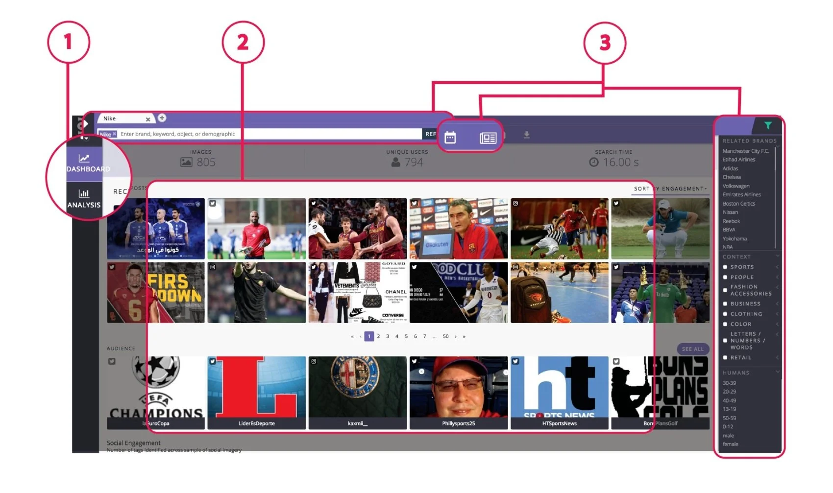
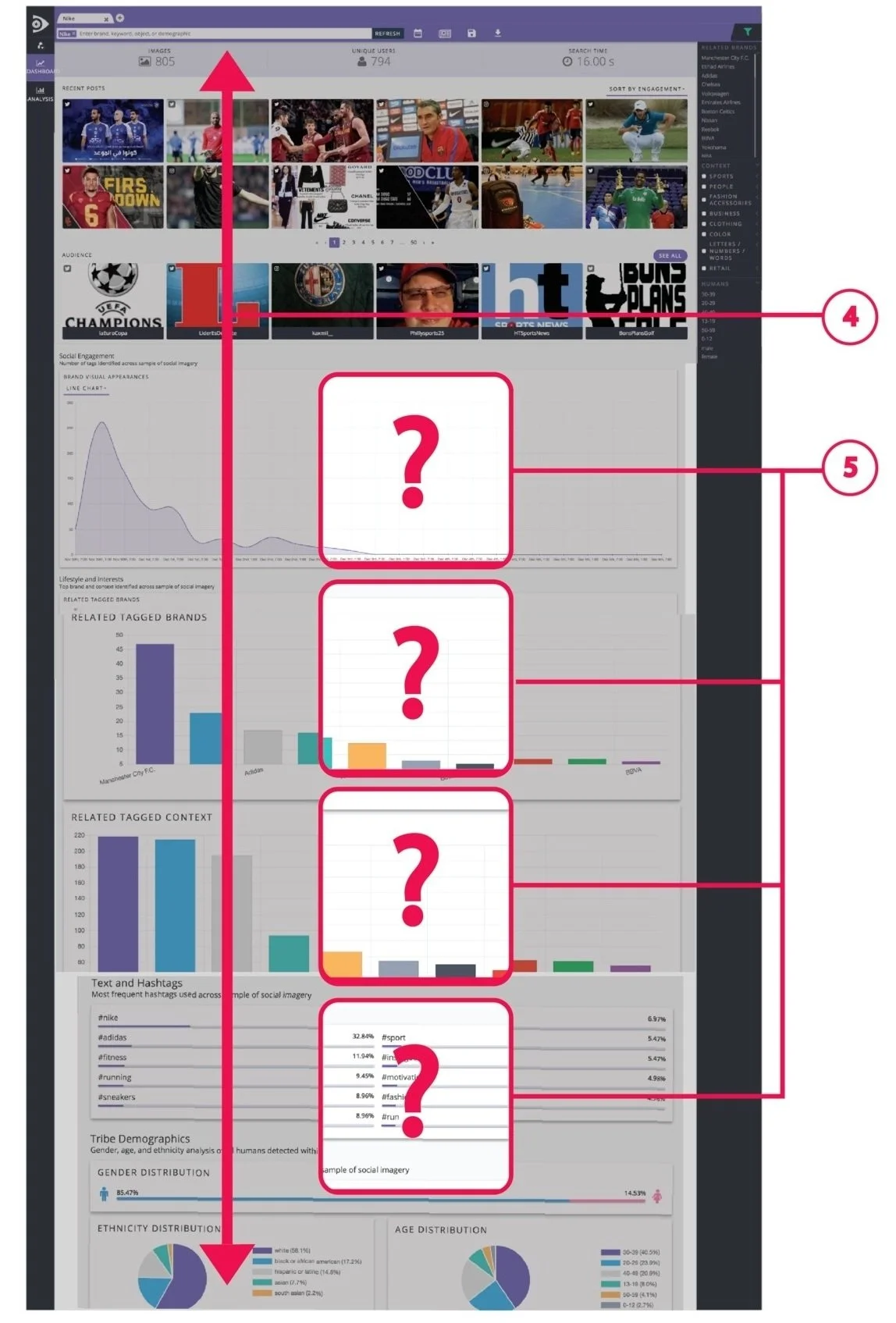
LEGACY DASHBOARD
PRE-RESEARCH
As a result of overviewing the overall UX on existing dashboard, I synthesized my initial hypotheses:
1. Analysis function plays an important role in this project’s objectives, but it looks like “an outsider”, therefore, its function is rather unclear at first sight. Since, essentially, we’d want to see / compare the data from DASHBOARD and ANALYSIS consistently, side by side, It would make more sense if ANALYSIS was placed inside the DASHBOARD ,and for clarity, named differently.
2. Besides playing the role of a main source of data, displaying lots of pictures as first and foremost doesn’t seem necessary for someone who’s mainly interested in the data itself (not the source of it). Also, due to the large amount of images on display and eager loading of those images, it results in excessive load time and frustration that comes with it. To solve that problem, there’ll need to be less images on display and lazy loading implemented .
3. Instead of having different search options and search filters scattered all around the page, I think It would be more effective to have them in one place. This way, the eye would stay focused on the task.
4. Data should be accessible to the viewer without scrolling much down. “Out of sight - out of mind” is the first expression that I thought of as I tried to make sense of generously displayed data but had to scroll down and forget what the previous charts were telling me. I thought that it would make a lot more sense to be able to compare all the displayed data but see just a peek at each chart then to see expanded charts scattered all over the page.
5. In my experience, a lot of times users rarely know what they want. At such times, putting something out in front of users provides tremendous value as it gives them first-hand experience at using the product.
DASHBOARD vs. ANALYSIS
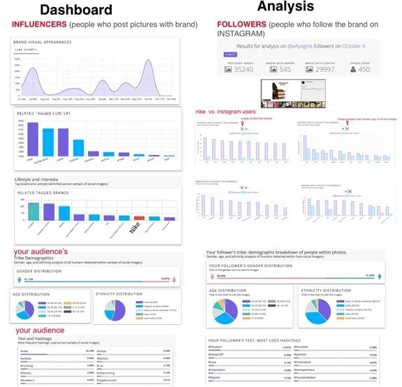
To understand the meaning and differences between the existing two sections, DASHBOARD and ANALYSIS., I placed the displayed data for each - side by side. I analyzed NIKE’s audience (DASHBOARD) and NIKE’s most influential follower (ANALYSIS), took screenshots and compared their charts.
Here’s what I discovered:
DASHBOARD displays the data about the audience / influencers, aka people who post pictures with a brand on Instagram or/and Twitter.
ANALYSIS displays the data about FOLLOWERS, aka people who follow the brand on Instagram.
In other words:
ANALYSIS = FOLLOWERS
DASHBOARD = AUDIENCE
NETRA INSTAGRAM ANALYSIS TOOL
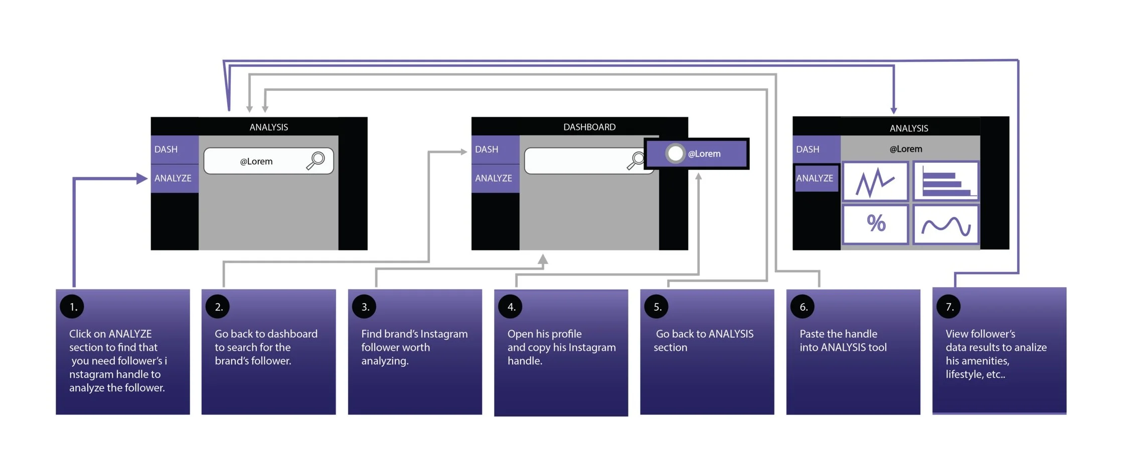
ANALYSIS TOOL - USER JOURNEY
Originally, the analysis tool required users to take a few extra steps to analyze the data on one of the brand's top followers, causing it to lose context.
RESEARCH
INTERVIEWS AND GUERILLA TESTING
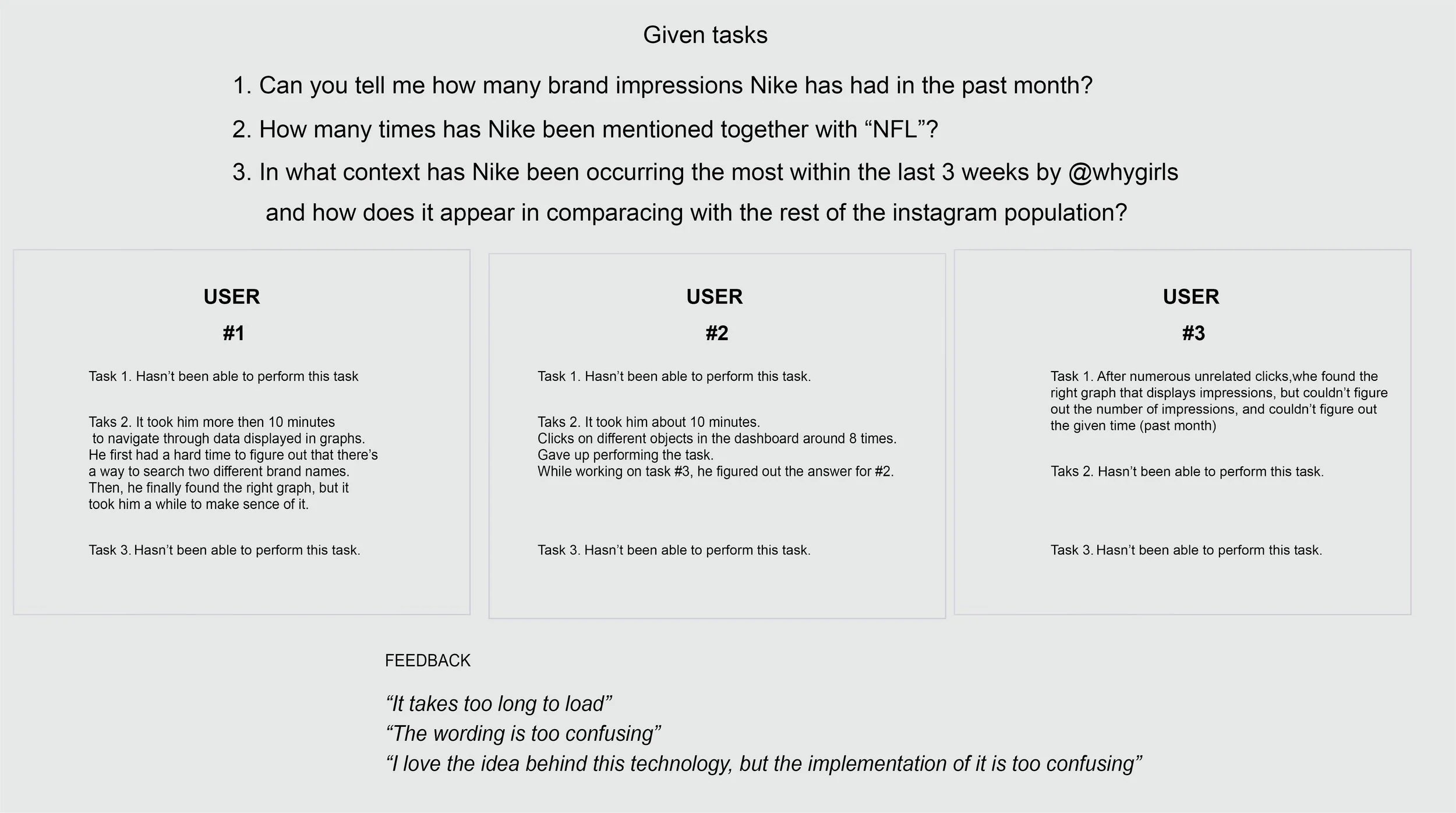
Prior to jumping right into architecting and designing my first mockup, to understand the problem scope and the overall user experience, we conducted 3 semi-structured interviews with our cohort fellas. It gave me a clearer understanding of the problem points that customers face while attempting to perform basic tasks.
PROBLEM DEFINED
1.Too much information displayed on one page = too busy to comprehend the presented data.
2.Terminology is confusing, and no explanation is available to clear things up.
3.Hierarchy of information does not make sense.
4. Unclear story / rationale behind the data
INITIAL SOLUTION
MY FIRST TAKE REDESIGNING THE DATA CENTRIC DASHBOARD
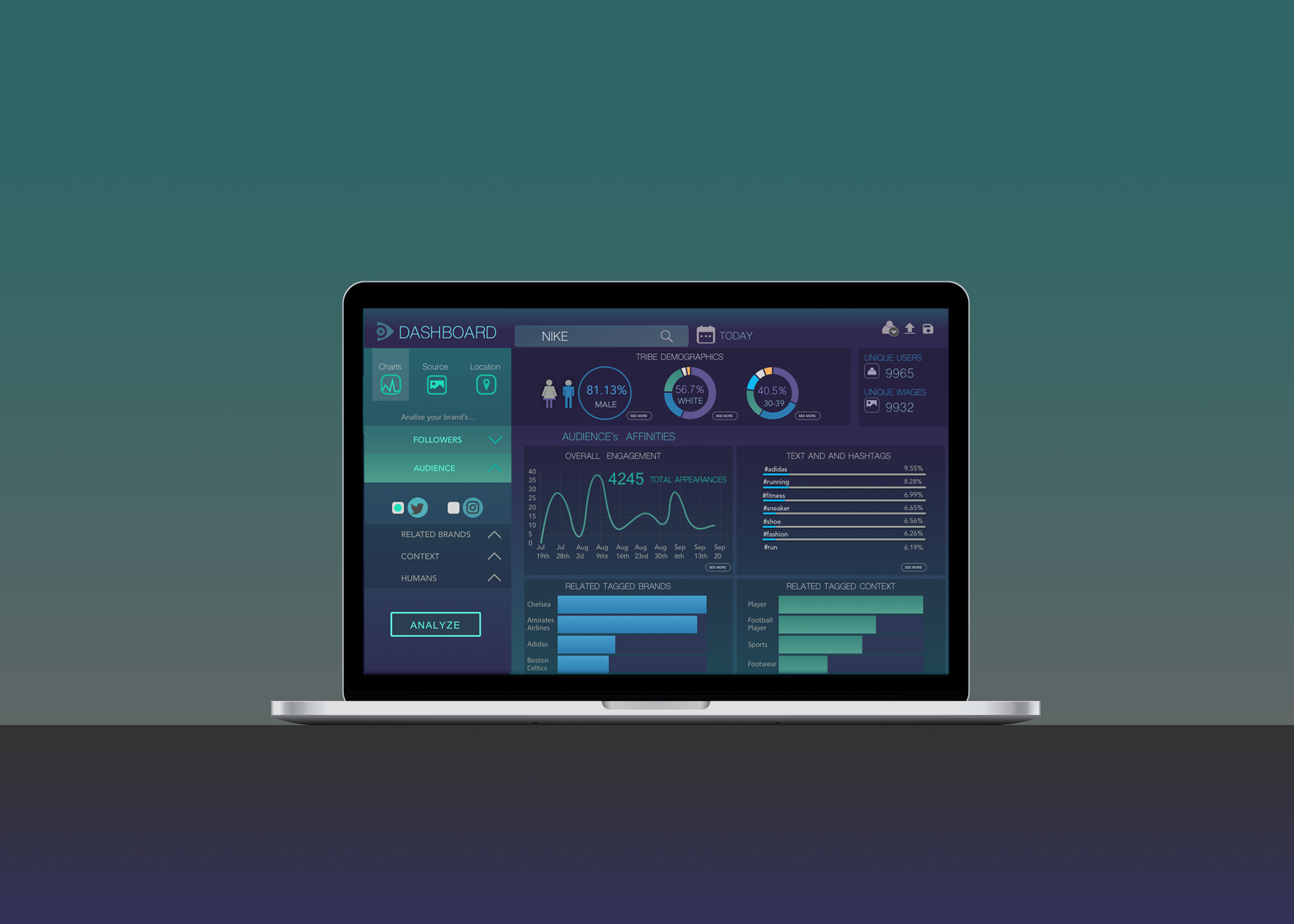
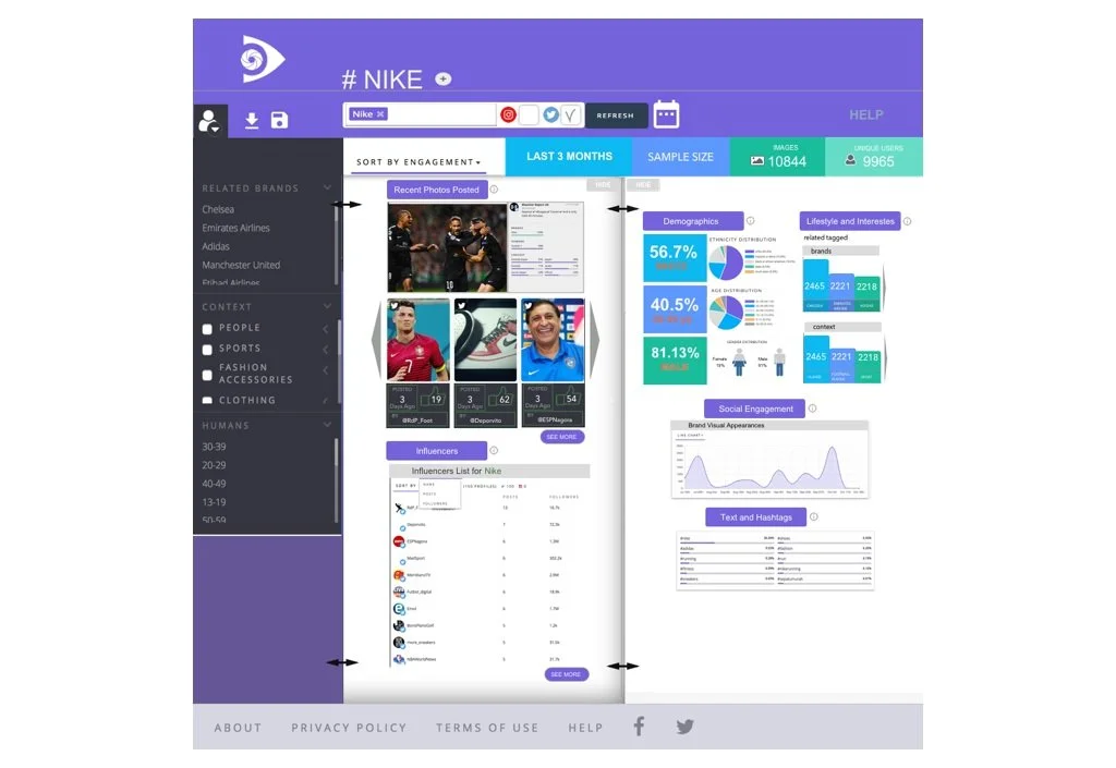
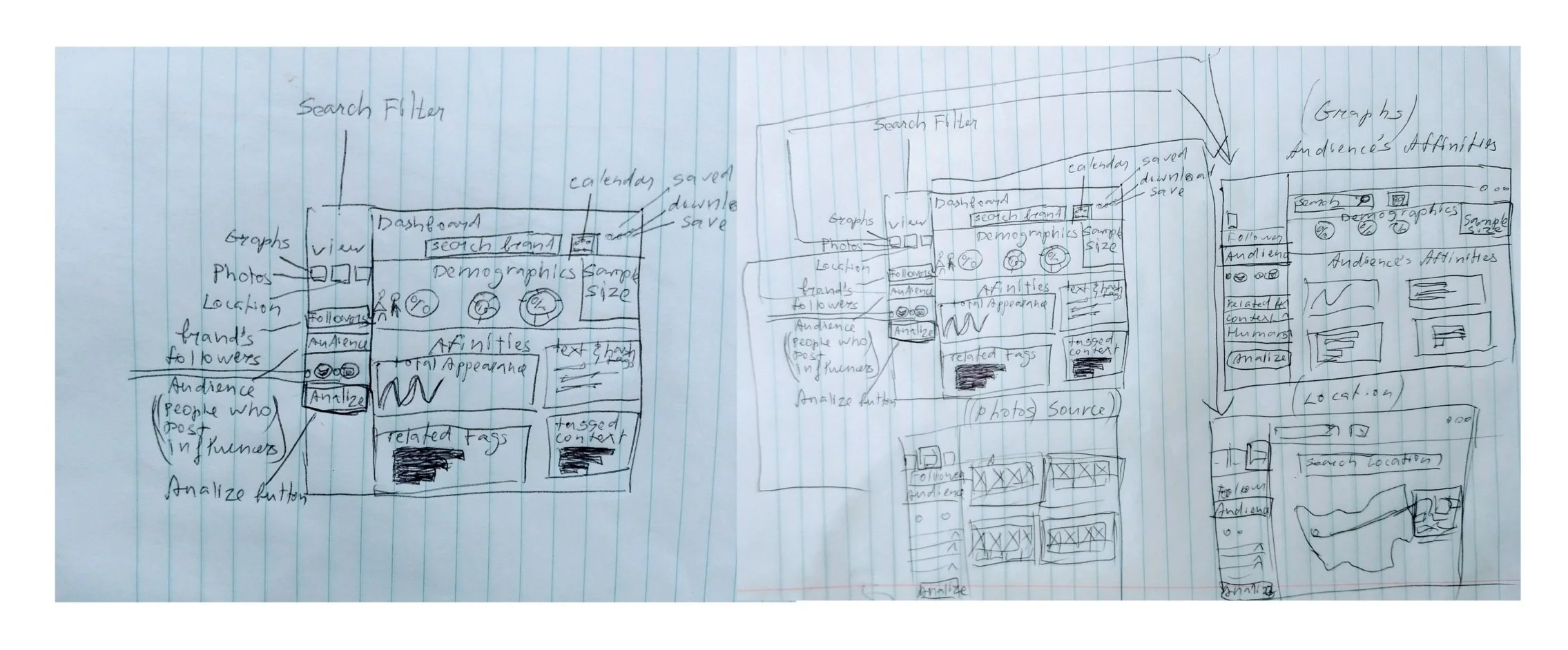
For an early first sprint meeting revision of my team, our potential users, and stakeholders, I prepared this rough mockup of the dashboard interface based on the results of our initial research.
ISSUES ADDRESSED
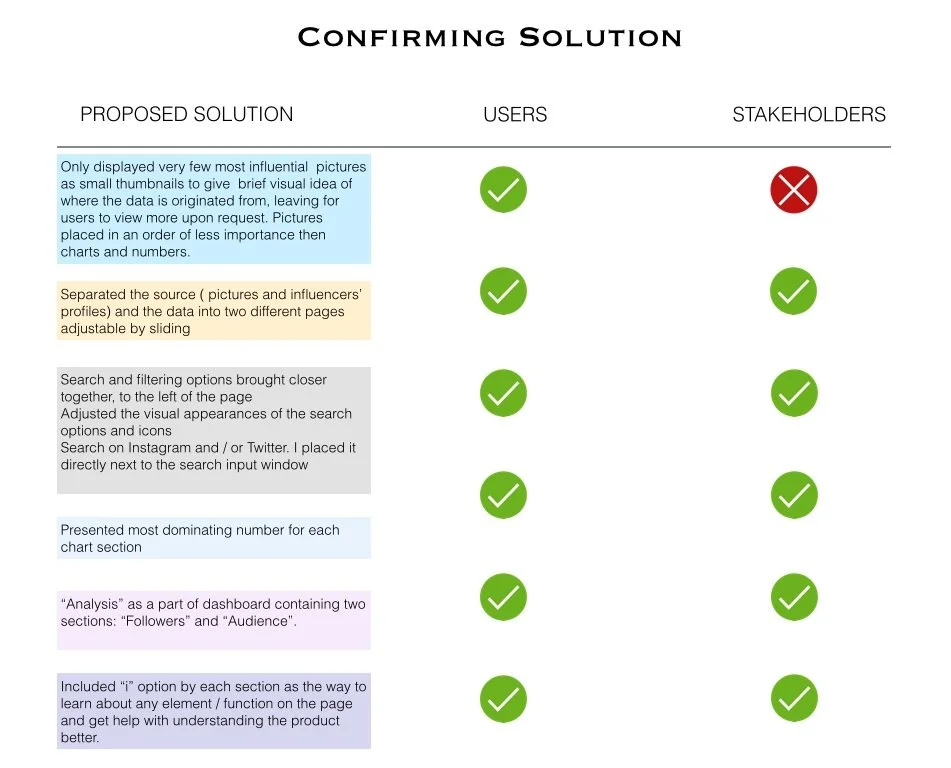
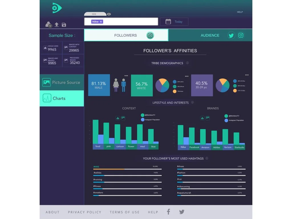
1. To make all the data displayed up in front of a user, without having to scroll down, I’ve made a decision to only show portions of charts depicting top results. I left it up to users to decide which chart they’d want to expand and see in more detail.
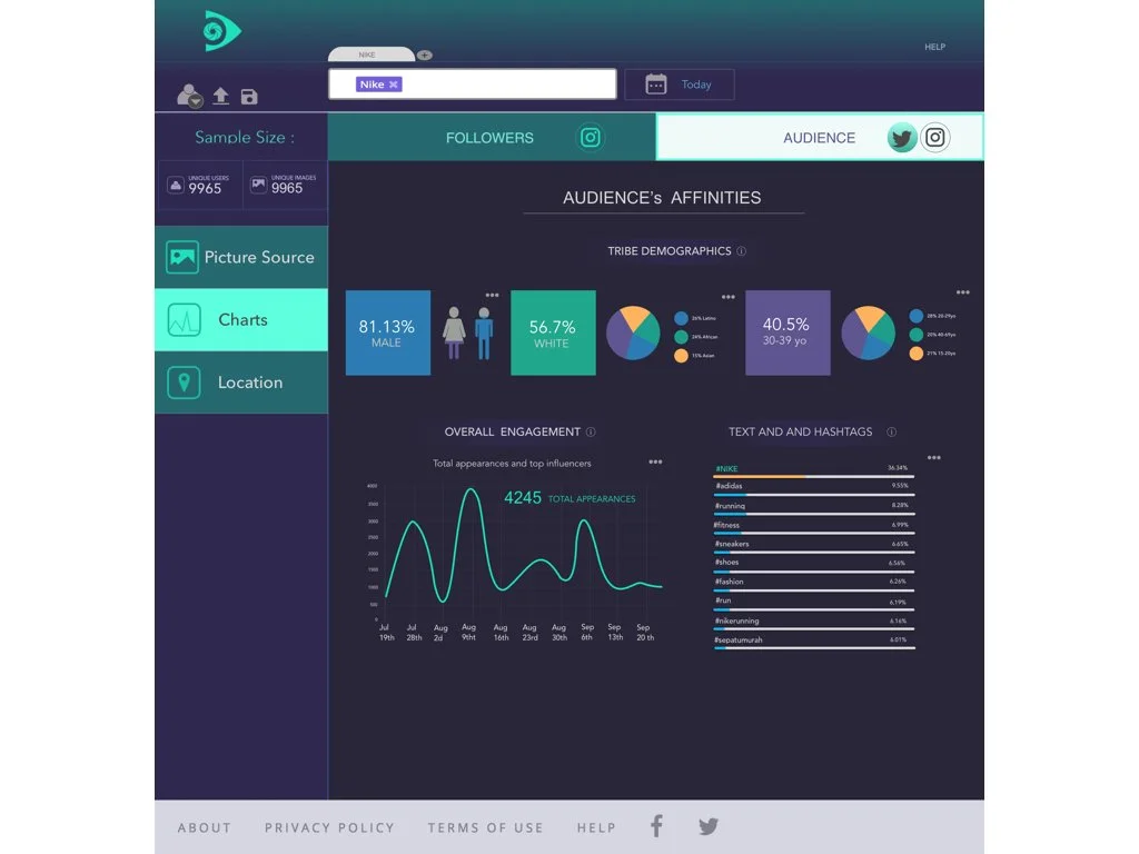
2. To make the overall displayed data “speak” to the user, I presented the most dominating number for each chart section. Exp.1. Largest percentage ( 81.13% male) - dominating gender that post most pictures with the brand within the given time slot. Exp.2 Number of total appearances (4245 total appearances) within the given time slot, etc...
3. To make the interface less busy and page loading time more efficient, I only displayed a few most influential pictures and also left it up to users to expand the view and see more images.
4. As a way to use the dashboard’s real estate wisely, without overloading the page, I separated the source ( pictures and influencers’ profiles) and the data ( extracted from source) into two different pages. For easy navigation through both, I thought It’d be a good idea to have a dashboard view fully adjustable by having them appear as sliding pages. One would be able to view those pages together or separately (by sliding over and hiding the page that’s less relevant)
5. For easier access and efficient search process, I placed all the search and filtering options closer together, to the left of the page.
6. What originally was hidden under a mysterious icon, turned out to be one of the most important search options - search on Instagram and/or Twitter. I placed it directly next to the search input. By having checkboxes by each social network, one would be able to search on both or either one .
7. Since, originally, there was no way for the user to clarify the reasoning behind the displayed data and no descriptions in case of uncertainty , I found it crucial for my new design to include an “i” option by each section. This way, user can learn about any element / function on the page and get help with understanding the product better. Something as simple as a brief explanation option can be a key to avoiding major frustration.
( By the time of the first sprint meeting, we still couldn’t get an “ANALYSIS” to function properly due to technical issues, so I left it untouched until more information can be accessed…)
USER TESTING
FOCUS GROUP
After the team has approved my design concept, we’ve conducted a focus group consisting of 5 marketing specialists, to put my first mockup to the test. The goal was to test the solution concept, clarity of components, and user efficiency. Participants gave us a ton of valuable feedback.
INSIGHTS FROM THE MEETING
After hearing a brief description of what Netra.io is about and given a description of some main functions this dashboard should be serving, our marketing group was given 5 minutes to familiarize themselves with the new interface design page.
Then, we asked them to share their interpretation of each element that they saw, and how they would see themselves using it for their marketing needs.
To my pleasant surprise, their response was quick, without much hesitation, and their understanding of all the presented elements was spot-on.
After our main discussion, we introduced the original dashboard to our focus group to get their brief feedback on what they think works in the redesigned version that didn't work before, and what doesn’t.
FEEDBACK
Our participants were all strongly against displaying a large number of pictures (if any), especially as first and foremost (like in the original version).
( Which contributed to my original point- presenting the source of data is not as crucial as the data itself.)
They complemented the idea of sliding screens and having a freedom to only display information of the main focus.
Overall, the feedback we received was surprisingly positive all around. Participants had a clear understanding of the design functions, presented data, placement of elements, etc..
“ As a marketer, I’m really constrained by time. Being able to see the dominating numbers is a great way to keep me engaged and informed”
“ I get it, the data is coming from pictures. It’s kinda neat, but I don’t usually have time for anything but the most essential when it comes to using data analytics tools.”
“I would want to see first: how my brand is doing lately; second: where my brand is standing compared to other brands; third: the related context; then, demographics; and then everything else.”
“I like that I can see a little of everything at once at first glance and then be able to research more thoroughly ”
“It’s a great technology that I can see myself using someday. Great start at making it user-friendly”
INTERVIEW WITH STAKEHOLDERS
To conclude the initial sprint, we needed to know whether or not my idea for the dashboard's interface meets the company's business needs.
FEEDBACK FROM STAKEHOLDERS
1. They were “married” to the idea of having more pictures displayed (regardless of user-research results ).
2. They were fascinated by the idea of having a workspace divided into separate adjustable screens, but there was a little concern that sliding screens would be too difficult to implement.
3. The new addition to the project was introduced and expected to be included in the final prototype - search by location.
CONFLICTING INTERESTS BETWEEN THE USER AND STAKEHOLDERS
To accommodate both, company and user’s needs, I created screens to preview separately, by clicking on separate tabs: SOURCE (to display pictures), CHARTS ( to display only data). and LOCATION ( to search by location)
SOLUTION IDEATION
HIGH FIDELITY PROTOTYPE
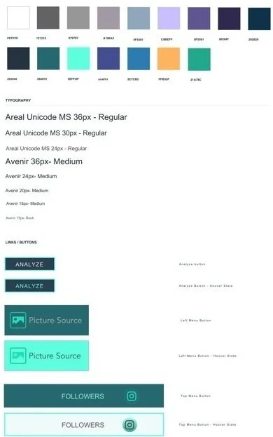
After determining major screens, I designed high fidelity prototypes starting with creating a style guide for the user interface.
VISUAL DESIGN STYLE GUIDE
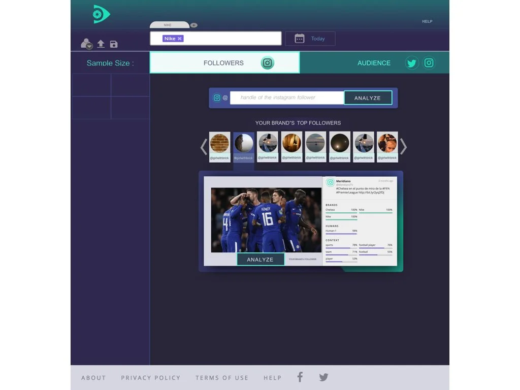
ANALYSIS OF BRAND'S FOLLOWERS
Here, you can either browse from the selection and choose one of the suggested top brand’s followers, or go the old way: paste follower’s instagram handle. This way, if the user doesn’t have anyone specific in mind, he can see the top influential followers and analyze them without all of the unnecessary steps.
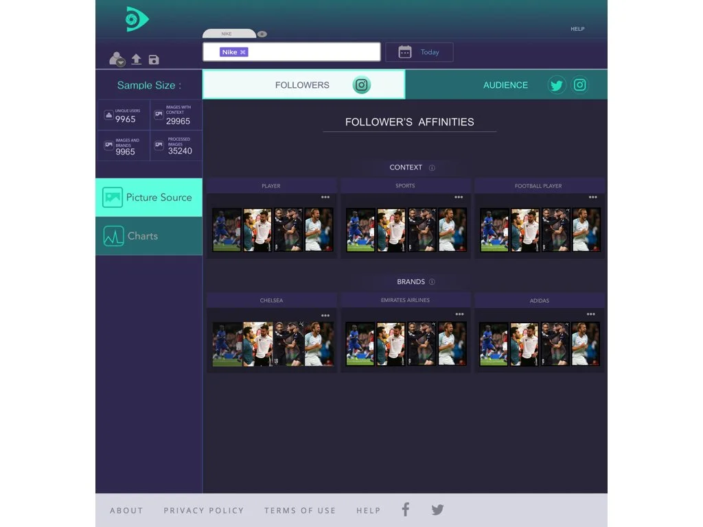
Here are follower’s pictures to browse from - I organized them into main categories of different follower’s affinities . Only a few images represent each category. Upon request, the user can click and reveal more.
Data presented in charts.
This way, one can thoroughly analyze the data coming from follower’s activities and appearance on social networks.
Picture source view.
Here, you can see the pictures organized in different categories, just like for brand’s followers.
AUDIENCE
Chart view
Data presented in the form of charts.
Location
Here, one would be able to search a brand's social appearance based on location.
FINAL SOLUTION
Dashboard screen 1
Dashboard screen 2

